Description:
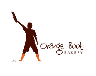
This is a logo concept for some of the best clients I've ever had. Mark and Cindy are opening up an artisan bakery. All the best ingredients and a really fun vibe.
This is the first of three concepts. A young boy (inspired by their son) holding a baguette triumphantly in the air as if he just won a sword fight with it, in a pair of orange boots.
I'll likely do a case study on them because they filled out the brief as if they were designers themselves.
A very fun project!
As seen on:
www.zephyrcreative.ca
Status:
Work in progress
Viewed:
5065
Share:

Lets Discuss
Sounding like the client is leaning in this direction. Any feedback is welcome.
ReplyYou're always good for feedback, Anthony. Thanks a lot! The font is somewhat fixed as this is the look the Orange Boot is going for. The client wants to go with this font. I will definitely fix the spacing between the two word and make the 'bakery' fit better.
ReplyPlease login/signup to make a comment, registration is easy