Description:
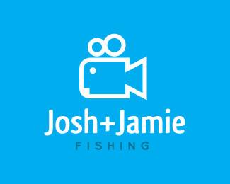
Second version of the Logo. Less details as suggested. Concept for 2 guys who go out and film themselves fishing to produce DVD's. play on a camera + fish.
Status:
Nothing set
Viewed:
8165
Share:



Lets Discuss
As sugegsted by Siah-Design. Thanks!
ReplyYea, this is looking much better!
ReplyFishing? I see the fish (as well as the Myspace logo), but my first thought was a movie camera.
ReplyCleverly simply. Nice job!
ReplyNice mark, simple yet conveys both messages without cluttering.
ReplyGreat mark, the font fits quite well (is that Qlassic?), but I'd consider using an ampersand.
ReplyThanks all!**Yep, spot on the money madebyshift. I'm not 100%25 happy with it, so maybe the ampersand is what it needs.
ReplyNice concept here. :)
ReplySee a movie camera too
ReplyI have posted a new version of this %3Ca href%3Dhttp://logopond.com/gallery/detail/58266%3Ehere%3C/a%3E
Replyagreed, too much Myspace and camera, far too less fishing. Sorry
Replygreat work ... like it !!
ReplyPlease login/signup to make a comment, registration is easy