Description:
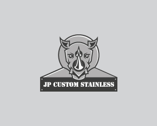
Another different angle. Going for the mascot look. Client sells and makes items out of stainless steel and wanted a rhino as the business' icon.
Status:
Work in progress
Viewed:
2469
Share:
Lets Discuss
Having some trouble combining the text element to the icon. Client requested them to be joined.
ReplyMaybe if the whole thing was like a metal plate, with the text and rhino both on it? I really love the white highlights in the rhino, and I would add even more of that around the horns. Really nice work! This concept seems a bit more appealing to me, especially if they are like some of the metal shops I have seen that often do work for custom motorcycles and cars, as well as industrial and commercial work.
ReplyThanks for the input lumavine. I have updated it with more highlights and done an idea to merge the text and icon into one fluid image.
ReplyPlease login/signup to make a comment, registration is easy