Description:
The customer asked:
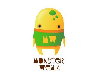
"We would like a logo for a web page about textiles, specially shirts and jeans, focusing on young people.
We want an alien that looks sweet, because our target audience is teenage children.
It must be simple but striking. Stylish."
I would love comments!
Status:
Just for fun
Viewed:
3670
Share:


Lets Discuss
Very cool! The illustration is amazing. I'm just afraid if it is too infantile for teens. Maybe a more contemporary font could help.
Replyhmmm...yeah...feels like it skews way too young. nice art though.
Replythanks for the comments! really :)
Replyvery enjoyable illustration... nicely done...
Replythanks :) *i really appreciate your comments :D
Replylove it
Replythanks a lot! :)
ReplySame comments as above, as far as audience goes, but the work itself is fantastic.
Replychad, thanks for the comment, it's critic and sweet at the same time :)
ReplyPlease login/signup to make a comment, registration is easy