Description:
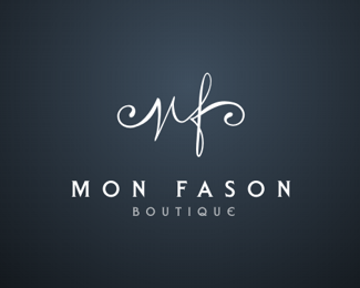
logo for a boutique for men and women. any suggestions on how to go about refining this?
Status:
Nothing set
Viewed:
5106
Share:


Lets Discuss
boutique is off centre. I would nudge to the left
ReplyAnd the mark needs to be centered too
ReplyMaybe a little more work on the logo mark. I see a N there that's trying hard to look like an M.*Also you could try to center the whole thing: Monfason, Boutique and the mark. And make the mark a little thinner and smaller.*That's what I would do.
ReplyCenter this baby up and you got a winner. Very nice feel to it.
Replyhaha thanks guys i've managed to upload the wrong, messed up version darnit
Replyi've uploaded the correct and updated version based on your ideas. thanks a lot friends :)
ReplyI think this looks better
Replyvery nice...
ReplyWoahdesigns - luv the mf font, can you share the name or did you create it?
ReplyPlease login/signup to make a comment, registration is easy