Float
(Floaters:
1 )
Description:
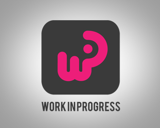
The logotype is a stylization of our short name, wip.
Status:
Nothing set
Viewed:
1095
Share:
Lets Discuss
I like the mark, it seems a little off balanced though. The 'w' and 'i' are smart, the 'p' needs work, it's too over bearing at the moment.
ReplyPlease login/signup to make a comment, registration is easy