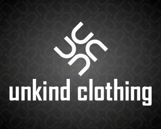
Description:
I made this logo for another kind of contest but i'm not late for this, see a better and bigger preview here http://wilsoninc.deviantart.com/art/Unkind-Clothing-75799002
Status:
Nothing set
Viewed:
4131
Share:

Lets Discuss
this has overtones of the Nazi swastika ...
ReplyYes. First thing i thought as well. You should rethink the composition.
Replythanks guys! i haven't noted that! :S
ReplyI love marks that can easily be made into patterns, but I saw a swastika too.
ReplyI didn't see a swastika until they mentioned it, but alas, that symbol had origins in another culture where it did NOT mean hatred. So, if you're wanting to tweak it a bit, I would suggest that maybe change the direction of some of the %22u%22 shapes. I'm not sure how but maybe that would subtract from the swastica-esque element of it.**:) Nice work, though.
ReplyYes, it's unfortunate that an ancient symbol has to be ostracized - but given the fact that the corrupted version is so deeply entrenched in people's minds (at least in the West) it's better to give it a body swerve. You don't want people getting the wrong message...
ReplyI don't know how well this will help, but the Nazi symbol was a mirrored version of the original meaning peace. Possibly switch it that way. Although I don't know how known that little fact is and those whom are not aware of it may still see it as a sign of hate.
ReplyI would avoid it either way - you could get away with it in India perhaps, but it's too loaded with negative connotations, whether reversed/mirrored or not.
Replythanks for all the comments! i'm thinking on another concept at the moment, and yeah i don't want people to get the wrong message! :P
ReplyGo for it wilson!!
Replywell after all i think the guy that starts the contest looks like is a false offer. But wait for other i'm doing this week.
ReplyPlease login/signup to make a comment, registration is easy