Description:
* The logo is not finished and I'm looking for your advice! Thank you! *
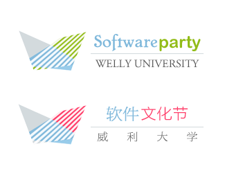
This logo is for a series of extra-curricular activities in an university for undergraduate students. The event is on software, including programming, computer arts, gaming, etc.
The shape is based on the letter W.
Since software is very abstract, it is hard for me to design. This one is still not quite satisfying.
The lower one shows another color way with Chinese.
Thanks a lot for your advice (and ctitiques :D) !!
Status:
Nothing set
Viewed:
1395
Share:
Lets Discuss
I like the Chinese type better. Maybe stack the logo on top of the type? The mark dosen't lock well with the type. Make the characters on the bottom line same size/style grey?. Lose the line? IMO's.
ReplyOne too many typefaces. I'd change Party to the same font as Software. The mark is too abstract IMO and needs work. At the very least it needs more contrast in the green-blue version.
ReplyThanks for your advices! I'll keep working on it and upload new ones%7E
ReplyPlease login/signup to make a comment, registration is easy