Description:
My Own Logo
As seen on:
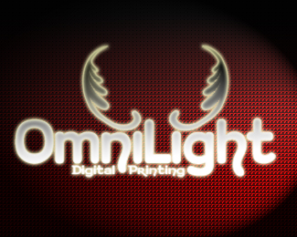
Omnilight
Status:
Nothing set
Viewed:
652
Share:



Lets Discuss
The logo itself is just OK - the flourishes don't really add anything to it. The background is kind of cool, but that combined with our glow effect on your type makes this very difficult to read, especially on your smaller type. I would think that illegibility and blurryness isn't exactly what you want to convey as a digital printer.**I would also imagine that this has to be printed out of 4-color process every time too, which isn't very cost-effective. Sorry.
ReplyPlease login/signup to make a comment, registration is easy