Description:
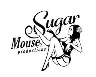
Illustrative logo for a dance and promotion company that wanted an elegant but cartoony dancing portraying a modernised version of Moulin Rouge style
Status:
Nothing set
Viewed:
6375
Share:



Lets Discuss
Overall, the drawing is well done, the girl is hot. Couple of things though... her left arm looks like its propped up on her left boob. Might look better if you had it straight and propping herself up with it on the floor/ground. Also, you've got the two main words of the name separated and at different sizes which suggest a hierarchy of importance in the title. %22Sugar%22 and %22Mouse%22 need to be together on the same line IMO and at the same size. Or, at the very be at the same size and stacked more sequentially from left to right instead of right to left. Either way, nice work.
ReplyOne other nit-picky point to add, the girl's left arm and hand seem wrong. The elbow is too squared off and the hand seems too large and masculine. This has a nice feel though.
ReplyCheers for the critique - the type is from an earlier build of the logo but chose this one as it fitted nicely in the space while showing the drawing off clearly ... **Also worth noting in other instances her left arm is placed on the rim of a martini glass shes sat in so it explains the weird positioning
Replysweet
ReplyPlease login/signup to make a comment, registration is easy