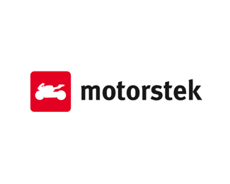
Description:
Motorstek is the biggest Dutch motorcycle community. It's a Hyves-like website and the logo should be recognizable. I thought it should be with primal colors and the logo could look like a label. "Stek" is Dutch for 'place'...
As seen on:
http://motorstek.nl
Status:
Nothing set
Viewed:
3082
Share:


Lets Discuss
I like the overall concept of the mark, and the typography is quite nice. I have two suggestions:**1) Is %22stek%22 a slightly different weight than %22motor%22? If it is, you need to either differentiate the weights more or make them the same, because right now it looks more like an error.*2) As for the mark, there's something in the lines that is throwing me off. I think it's the straight line on the bottom between the wheels, and that the body is not clearly separate from the front.
ReplyThanks for comments... 1) the word motorstek is one word, 'stek' is Dutch for place. In the Dutch grammar it is combined to one word... 2) maybe I'll make the straight line between the wheels under a little angle (15 degrees or something).
ReplyPlease login/signup to make a comment, registration is easy