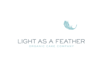
Description:
Logo for a trendy bakery specializing in the creation of high-end cakes using only organic ingredients
Status:
Client work
Viewed:
5515
Share:

Lets Discuss
Good choice of colors for something that is light, _but_ the gray/blue palette is not working for a bakery. It is an exact opposite from what's the expected hue is, which is brown.
Replyepsilon, couldn't agree more and thanks a ton for the input. I was surprised they chose this one over the more %22earthy%22 toned alternatives that were also presented. But it looks like you just proved their point. The client wanted a logo that was %22different%22 than what you would normally see when it comes to a bakery because of their different approach to preparing the cakes, which is done organically. Makes sense because they are indeed the %22exact opposite%22 to most bakeries out there. Healthy cakes?! Well, let's just say %22not as bad for you%22 cakes :)**Here's a %22short%22 list of their criteria: no candles, no cakes, no script fonts mimicking icing, no handwritten infant style or blocky fonts, no rainbow of colors - limit it to 2 or 3 but not including brown - too common when it comes to baked goods and or green - it's overused in the organic market.
ReplyWell, yeah, it was ultimately their choice, but I think they chose wrong. This logo is more fit for a soap or a bed linen shop. Perhaps for a air freshener, but not for a bread. They may be different, but with this logo they will end up spending a lot of extra effort trying to convince potential customers that they are not _that_ different and their cakes are still edible :)
ReplyPlease login/signup to make a comment, registration is easy