Description:
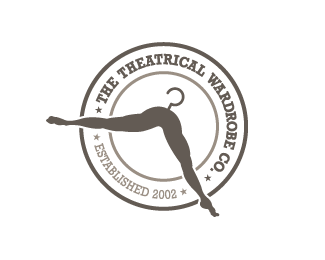
UPDATED VERSION with Typography in place. Logo design for a wardrobe rental company that supplies theatrical costumes for all the performing arts but mostly ballet. Thanks for looking!
Status:
Client work
Viewed:
9090
Tags:
wiking
Share:

Lets Discuss
This in brilliant as a brand, congrats!
Replyvery smooth
Reply%5E kind of disturbing actually. But it sure _is_ memorable.
Replyvery nice! i think it communicates exactly what it should! where are the types though? arent there any?
Replyquirky (like the scissors sisters logo). Really like it, one thing thing for sure you wont be forgetting this in hurry, well done...!!!
Replybrilliant!
ReplyClever, fantastic and a little bit quirky...perfect for the target group!
ReplyThanks everyone for the positive feedback. Have to give the client some credit on this one. They gave me free range to be creative and were really open minded. Now if all clients were like that we'd all be happy.**sonap: to answer your question, there are no types for this ID.
Replyawesome
Replyjust a little bit explicit.
Replyvery clever, love it!
ReplySuper clever and memorable.
ReplyThanks guys!
ReplyMy mom actually has a hanger like that.
ReplyWow. Very elegant.
ReplyThanks alldesign!
Replyveryyy coll
ReplyThank you luiz!!
ReplyVery Nice!
ReplyHa! Clever! %3B)
ReplyThanks Adam and Michael! Much appreciated.
ReplyGood legs, great logo!
ReplyThanks Alena!!
Replysuper cool logo
Replyyikes. this is a lil' risque! i can't help but think of this: http://www.encyclopedia.com/video/3P8bmOSPDH0-tenacious-d-master-exploder-live.aspx
ReplyThanks gareth, means a lot coming from someone with your skills!*Nathan, risque...indeed. Was surprised the client went with it.
ReplyUpdated version that includes the typography.
Reply%22Established 2002%22 should be right side up, I think.
Replyvon'aet. Eto ploho
ReplyAgree with Sam. The %22Established 2002%22 doesn't feel right upside down.
ReplyMy first thought on the smaller image was a mustache. That could be just me. I think you have a solid concept there.
Reply...Memorable logos are great!! :)
Replyawesome work mate!
ReplyThere is a side which doesn't need to be passed
ReplyLooks scary... Legs without a body... And i think that %22Established 2002%22 should be right side up.
ReplyUpdated version with %22Established 2002%22 right side up. Thanks for the gallery addition, for all the great feedback and floats. Means a lot!!
ReplyIt's seems like a women was doing a splits and now falling into a well :) IMHO, now hard fillings.
ReplyVery creative. I like how you used the legs as a hanger.
ReplyBravo!
Reply@ hypocrite no hard feelings taken :)*@ clypso - thanks!*@ folkypaul - thanks for the comment, means a lot coming from someone with your crazy skills. Love your showcase.
Replywell done!
ReplyThanks Rick! Really dig your Human Elements logo.
ReplyFantastic and good idea :)
ReplyThanks my friend. Glad you liked it.
ReplyAwesome work, very clever!
ReplyHey, thanks John!
ReplyBriliant!
ReplyThanks Paul!
ReplyPlease login/signup to make a comment, registration is easy