Description:
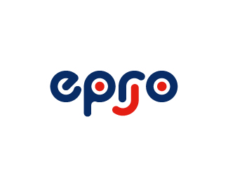
Epro are a manufacturer of childrens creative toys. The logo was developed in reflection of their tag / motto: "simple, creative joy" with the logo composed of simple shapes (based upon a circle) creatively forming a joyful face with an addition of an upside down "r".
The type was built from scratch using a circular shape as a guide.
Status:
Client work
Viewed:
8232
Share:

Lets Discuss
Please login/signup to make a comment, registration is easy