OSSEBO
by watermarker • Uploaded: Jul. 01 '13 - Gallerized: Jul. '13

Float
(Floaters:
51 )
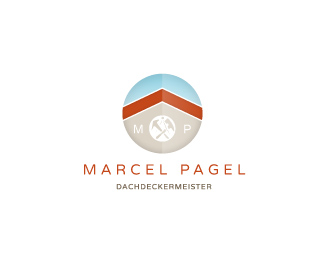
Description:
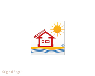
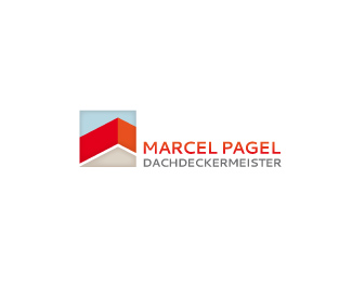
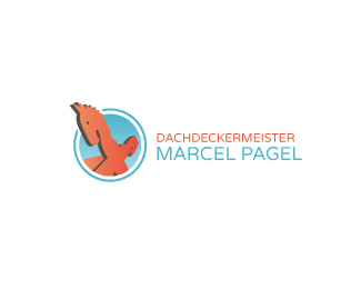
Well, I'd like to show with this, how my usual daily work is like. I was asked for a low budged redesign of an existing logo. However... the 'logo' was something rather like a clipart from MS Word (with registration mark!) . All criterias I had, was 'modern, fresh and all elements, seen in the old logo has to be in the new one'. So I felt quite free to be creative.
It then went this way:
Design A: "Too 'high society'!" (I admit, I might have been on the wrong trip here)
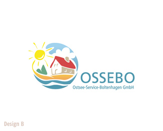
Design B: "Alright, but less floral shapes pls, more geometric and positions closer to our old logo." (Oh my!)
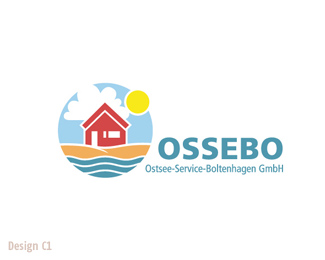
Design C1: "Yes, ok. Pls change the roof, make the cloud smaller and add rays to the sun." (starting fiddeling mode)
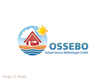
Design C2 was it then and the customer was happy (I am less). However, I learned a few things: There exists nothing like a 'low budged redesign' and I fail in selling my work properly.
:P
As seen on:
Status:
Client work
Viewed:
11683
Tags:
•
house
•
real estate
•
holiday
Share:

Lets Discuss
unique love the style!
ReplyThx! Quite impressibe showcase you own, BTW!
ReplyNice color palette
Replylike!!!!!!!!
Reply!!!
ReplyCrazy people. But then it is their logo and they have to be true to themselves in the end. I would keep this for a future client who will appreciate it for how lovely it really is. Congrats on getting in the gallery, too! It deserves it.
ReplyHooray! Thanks all for being so kind! :)
Replyfrst on fantastic!
Replyasgjasd
ReplyDesign A is by far the most visually appealing. It's beautiful and calming, and unique in its composition. It's really unfortunate that your client could not see the greatness in this design.
ReplyConsidering your client told you that Design A was too high society, I think you did a wonderful job with Design B, and aesthetically, this one is a close 2nd in my opinion. It's really quite a shame that your client still couldn't see the value in this design.
Sadly, the other attempts - including the chosen design - fall victim to weak client art direction, and have lost the strong sense of uniqueness, character, and charm that was overflowing in your first two concepts. I know you did the absolute best you could under the unfortunate circumstances, though, so kudos to you for making the best out of a bad situation.
I will say that the chosen logo is a lot better than what they had, so a win is a win, I suppose. At least you have your other beautiful designs that you can show off here and elsewhere.
it's not so bad. you got beter design to sell it later. haha
Replynice
ReplyThanks, guys!
ReplyJon, really appreciating your spot on comment. In fact I can live with it all very well. I got the money and reputions.
What bugs me most is, that (in a sense of a better world) I hadn't the guts to tell my client, that his new logo looks like from a weather forecast and that his so called corporate design is nothing worth and he better should take some good money in his hands to get that cured. I suppose, its the dream of a lot of 'smaller' selfemployed designers like me, to be financially big enough to be able to do so without even batting an eye. :D
(reputations)
ReplySimple beauty
ReplyBeautiful, love it!
ReplyPlease login/signup to make a comment, registration is easy