Description:
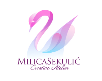
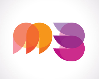
Logo for woman owned web design studio.
As seen on:
egopop®
Status:
Client work
Viewed:
40678
Share:


Lets Discuss
nice image.
Replynice use of transparency!
ReplyBeautiful work.%0D*
ReplyVery nice use of colors and shapes, very gracefully.
ReplyI think the mark may be a little too busy and would look stronger if it was simplified. You wouldn't be able to use this logo well on anything but the web, but maybe that will be its only use.**I really like the concept of it, but simplifying it might be something to try.
ReplyClimax Designs...I could not agree more. Another commonly held convention that says a logo is not good if it can't be reproduced in B%26W...I just don't buy it. People buy and use colorful and complex logos all the time without the need for a B%26W version. **As a speeder would say, %22rules are meant to be broken%22...when necessary.**I, for one, don't like to be put into a straight jacket.
Reply%5EI agree with you all. I guess it comes down to Good or Great logo. Yes anything can be reproduced as a logo or mark but not all can be done on any medium.
ReplyLet me say, the medium here is an embroidered t shirt for instance.
ReplyYep, web design studio. 99%25 of clients come from web, the rest can be attracted via full color business cards. No bw, no embroidery, just plain cheap colorful pixels on beautiful web site/portfolio and that is all you need in this industry :)
ReplyIn fact this logo converts to grayscale just fine (try it)...and with today's printing technology...4 color offset is no problem either...as long as you build a print version with accurate cmyk and not just what you see on screen.
Replygreat
ReplyAwesome logo. I like the subtle use of the company initials creating the swan. Gorgeous design, very inspiring!
ReplyDelicate, colorful logo! I very like it! Great work!
ReplyMy comment was not sarcasm at all, in fact I was one of the first to comment and vote on it :) I like it it just giving my opinion that's all. I think if you have to change the integrity of a design just to make it work in certain cases it's not as strong as one (overall) that can be reproduced on any medium with little or no changes.
Replyummm... sarcasm? David? Wassup? I wanted to stress out that the real power of logos these days is not so tied in with it's usage across all mediums (especially the ones which will probably not going to be used in particular industry at all), rather it is important to make your identity shine in full on primary medium - in this case on screen. Secondary applications should be lacking if needed at all, not sacrificing primary usage here. Of course, grayscale or outline version would do just fine in this case if needed.
ReplyHey nothing wrong with transparencies peeps, just makes sure it has a starting point and and ending point and as solid as can be designed. Take it or leave it just opinions here. Don't get all upset over views.I can point out some good designed ones if you must.
Reply%22I think if you have to change the integrity of a design just to make it work in certain cases it's not as strong as one (overall) that can be reproduced on any medium with little or no changes.%22**Well said.
Reply%22I think if you have to change the integrity of a design just to make it work in certain cases it's not as strong as one (overall) that can be reproduced on any medium with little or no changes.**%22Yeah well said, even though I break those rules frequently :/
ReplyRadhacelis...perhaps you should move on to Design 201 or 301 or 401 or 501....when you put yourself in a self imposed %22rule-jail%22...well, your results will be limited. Some rules work all of the time and for good reason and some rules can be broken...successfully so.
Replyayokiyapayalle*
Replyinteresting
ReplyAbsolutely beautiful design.
ReplyI hear ya, youre right... text%26tone doesn't go well sometimes, and yes, i tend to cherish sarcasm from time to time %3B) glad to see this in gallery at the end. Cheers!
ReplyGolly...that's purty.
Replyvudstock - some guy from 99Designs is trying to rip this one - http://99designs.com/contests/22621/designers/308295%23entry-143
Reply%5E%5E Dude, great find!!
ReplyGuys it's the same person, see link.
ReplyI thought this was work for a real client?
Replythank you all for your comments! i'm glad discussion was started here... it was interesting to hear what you all think.**and yes, the i'm the same guy from 99designs. i designed the swan earlier, tried to win this contest, but other design was chosen. later, my friend saw the design and instantly loved it. i thought it fitted her right (trust me, more than one person saw MS initials in that swan) so i decided to give it to her, as a gift. everybody is happy now. :)
Replycheers, makes sense now.
ReplyBeautiful !
ReplyReminded me instantly of the 'Swarovski' logo. But I like this one alot. I agree with guys here who said that it depends on the medium used. And about production, specially in print. Its good to always have a logo which is versatile, which can be used in various mediums with little or no variations. But this is all good! as i said before... it all depends on how you are going to use it. I always prefer very clean logo's which can work well on black and white or reverse.. but this isn't always the case! so thumbs up Dude
Replygorgeous. very nice work. *if anything i'd make the mark a bit smaller. and shift it up from the text a little.
ReplyPlease login/signup to make a comment, registration is easy