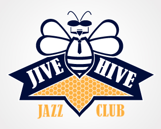
Description:
Personal project. Developed from a doodle of a bee and a memory of being at the House of Blues this last summer.
Status:
Just for fun
Viewed:
1985
Share:


Lets Discuss
I'm looking for suggestions/advice on the direction I'm going to this point with this logo. It does not feel complete to me yet, I'm just not sure why. I almost feel like I need to add something in the honey comb area, not sure though. Any thoughts are welcomed. Thanks!
ReplyI think you need to reduce this down rather than add any more to it.
ReplyI agree with Richard. Less is more in this case. I like the look and feel of the face on the bee, I'ld start there.*Simplify. I'm sure you'll get it there its a nice start.
ReplyI think its working overall. I would like to see it with the hexagons larger within that space as they might get lost when the logo is reduced in size. Maybe try some other versions of the bee's head.
ReplyThank you everyone for your comments. They are all very much appreciated. It's time now to go back to the drawing table. If your interesed I'll post next draft in a week or so. Thanks Again!
ReplyPlease login/signup to make a comment, registration is easy