Float
(Floaters:
16 )
Description:
Experimental work-in-progress.
Status:
Just for fun
Viewed:
4647
Share:
Lets Discuss
Too close? http://logopond.com/gallery/detail/91654
Replynot really.
ReplyNope.
ReplyDepends on who you ask, and who is asking I guess :%5E)*Thanks for the input guys.
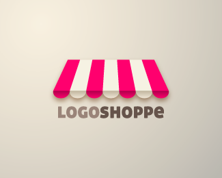
ReplyHi everyone,*Cheers for taking the time to view my very first post.**helvetic brands: I like the angle at which you chose to position the shopfront canopy in your Market logo, as well as the cleverly scalloped 'm'. It was not my intention to step on anyone's toes here with the use of a similar graphic element. It was just a fun exercise for me :)
Replyvisualization is good...
ReplyGood God what have they done to it.
ReplyACK!!! %5E%5EIgnore that
Replyit more looks like candy shoppe..
ReplyThe idea is great, though not loving the font and overall look..that shadow is a must? maybe you can create an inner part of that shop, some perspective, and try to integrate more the type into the logo.*
ReplyI think this idea is very interesting, David is a little indulgence, each design can be performed several times to come, but not the ideas of others as simple as that we condemn.
Replyi really like the pink...works well
ReplyCheers for the comments, everyone :)**myway999: The logo you see did evolve from a version that had a full storefront in it. However, I felt that it was rather cluttered and decided to simplify it by extracting the canopy and removing the rest of the storefront.
ReplySweet
ReplyPlease login/signup to make a comment, registration is easy