Description:
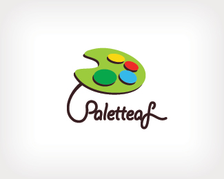
a creative way to present a palette shape in leaf, suitable for art gallery and art shop.
this is the latest version of the logo
*the palette now can be a leaf and letter "P"
*amendment on typography to make it look more interesting
*simplify the logo.
Status:
Unused proposal
Viewed:
2433
Share:
Lets Discuss
Nope, still not there... It's hard to read it (especially the last letter that might be an upper case L or S as well), mark too big compared with the text part and the need for the connection between the mark and text is questionable IMO... Improvement - yes, done - no...
ReplyI think it would be a major step forward if you got rid of the mark altogether.
Reply%5E And by that I mean, experiment with your type choice. It's pretty expressive. With some edits it may hit the nail on the head.
Replydrop the color (but leave the dabs of paints shapes, no color, its killing it) from the Palette and maybe even use a leaf style texture over it, the palette has to be subtle in its approach, this is where the concept is strong, but the execution is poor. As for the type, drop it, its crap, sorry for been blunt, look at your type options, if you are going to use this style, work at the execution more, handwrite it, scan it, vectorise it with some tlc. otherwise look around for a nice face in this style, tons of free stuff out there. As said the concept is there, its strong and could be a killer logo, just go at it again, sorry if I sound harsh I dont mean to be just trying to help. good luck.
ReplyIMHO, I think you are trying to make the leaf look too much like a palette. I say, let it look like a leaf, then the color spots on it will bring to light the fact that it is also a palette. And yes, find better type.
Replyhi to type08 : before do this amendment i have consider make some spacing between text to make it readable, but consider want to make the text is continuous, so i make them closet.**i still considering what font is more suitable and the size of the mark. thank for your precious comment.**all comment is welcome.
Reply@David... I stand by my comments. At times there is to much holding hands on this site, now before we get into a tit for tat reply, I think I have been very positive in my replies to vexeen, I hope he/she takes them at face value, he/she obviously does (as they have uploaded again based on other peoples comments from the last version).**And anyway I think Vexeen must have thick skin, based on the fact that their logo was in the gallery and its questioned as to why its there.. and its taken out? Personally think the logo would progressed much better based on feedback if had the front page.**
Replyhi to Chad Sanderson : the %22P%22 and %22F%22 is amended font, the less is the original font. still considering what font will more suitable or change the feeling of presentation mark.**what would you think ?? more serious font or curving font ?**
Replyhi to mcdseven : drop the color and use leaf style texture also a good idea. Will consider it and how to present it. the only thing is consider how to make it look more like a palette shape leaf.**thank for your opinion, receive and will try work on it.**
ReplyHi Vexeen,**Some nice fonts that could work are:**Linotype colibri*Linotype envito*Linotype Harlow (could be really interesting)**Basing this type on the style thats their...!
Replydont think that the pallette has to be in the shape of the leaf... if you take a rounded style leaf this link might help (http://www.oplin.org/tree/leaf/leaf%2520pages/017%2520simple%2520leaves/simple.html), good selection of free vectors out there, and use the bottom part of the palette which is distinct (where you hold it) and merge it with the leaf and maybe or maybe not use a leaf texture... hope this helps.
Reply@David, I know well how to speak to people so I really dont need a lecture on that, and I was not rude... now if I had said hey thats crap don't give up the day job... well I definitely would have something to answer to. Calling an execution 'poor' is what it is, and I have been pretty positive in my replies on how to improve the concept.**'Having a thick Skin' I think you missed the point on that. You deciding that Vexeens logo was to be taking out of the gallery after another user decided 'who jumped the gun' is more negative to the logo and the designer than a couple of 'blunt' and may I say honest opinions... btw Vexeen doesn't seem to have any problems with the comments, if they did and where offended, I'd would have no problems apologizing and explaining further my points.**So we can argue this all night or I'd say we'll agree to disagree.
Reply%5Eem, I dont know what way to take that comment! but aswell as using your admin ability keep reaching out or Joe Prince and Actiondesigner will declare war on each other! Peace brother.
ReplyPlease login/signup to make a comment, registration is easy