
Float
(Floaters:
1 )
Description:
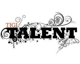
part of a branding campaign for a natural/organic hair care line
Status:
Nothing set
Viewed:
2026
Share:

Lets Discuss
This is really interesting. I would have pegged it for a skateboarding company or a band's logo at first glance. Is it in use already? Looks great!
ReplyDoesn't feel like anything I'd want to put anywhere near my hair. When I see it...I think dead crow. Color might help but...it just feels too dark.
Reply@gthobbs, If you knew the company it was designed for, you might think differently. Haha. But I agree, it's a bit dark - however, they specifically requested this style and who am I to disagree. %3B)***@kellyoneill, thanks - this one wasn't the one that ended up as the final choice. Still in revision rounds on a few pieces, though :)
ReplyWell then, if it's what they are looking for...WHO AM I to disagree?
Replyi like! %0D*%0D*muy interesante su uso para una tinta%0D*%0D*mmm de primer impacto se lee %22grow%22 en vez de %22Crow%22 por la terminacion de la letra %22C%22%0D*%0D*se percibe muy apocaliptico, si eso es lo que pide la empresa esta bien,%0D*%0D*saludos!!
ReplyAt first glance I thought it was a promotional movie logo for a new %22The Crow%22 movie. As gtobbs said, it's VERY dark. If the logo gets printed any smaller than this you're going to lose some of your detail, especially on uncoated stocks.**It's cool though.
ReplyPlease login/signup to make a comment, registration is easy