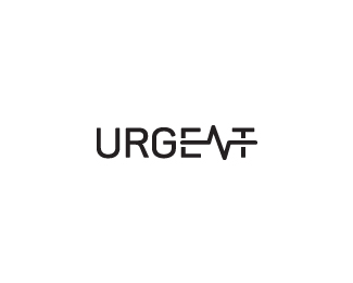
Urgent
by vaneltia • Uploaded: Jan. 26 '16 - Gallerized: Mar. '16


Float
(Floaters:
51 )
Description:
Logo for an urgent care physician who is offering concierge medicine and house calls for private patients.
Status:
Unused proposal
Viewed:
19690
Tags:
pulse
•
logotype
•
typography
•
call
Share:


Lets Discuss
Very cool the idea the mark!
Reply@MichaelDesign Thanks for your kind words! :)
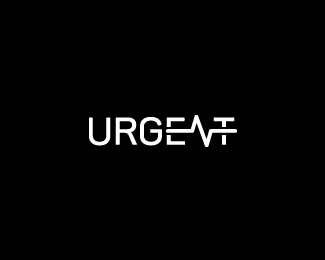
Replynot sure you even need the color break? Nice thinking.
Reply@logomotive Thanks for your suggestion. Yes I will definitely try an option without the color break later.
ReplyYeah, this is working well. I'd also like to see a 1 color version.
ReplyAdd a variation without the color break as suggested by @logomotive
Reply@ocularink Thanks mate, I've uploaded the 1 color versions as well. :)
Try the initial just as it is but change the pulse to white? Don't connect the letters...
Reply@logomotive Just updated the variations based on your input. Thanks a lot!
ReplyNice...
ReplyAlso good and surprisingly readable!
Reply@logoholik Thanks again! It took me some time to make the 'N' readable but in the end I'm satisfied with the result. :)
ReplyI love the idea, and your execution is great! Did you try connecting the pulse with the E and T in a way that makes those letters form a little rectangle that resembles a monitor screen? I think that would be fantastic.
Reply@lumavine Yes I've tried to incorporate the E and T to form a monitor screen but it didn't look good as it made the text more difficult to read and too complex for me. Thanks for your suggestion, I do appreciate it! :)
ReplyI meant something like this: https://www.flickr.com/photos/36524843@N00/25883865815
ReplyHey @lumavine thanks a lot for your input! It's great, but I still prefer my current version because the pulse length is more symmetrical ;) Thanks again!
ReplyPerfect!!!!!
Replycool !!
Reply@fraGila @Birds Many thanks! :)
ReplyPlease login/signup to make a comment, registration is easy