

Description:
Logo created for the project “Travel and Transport through Time” for the Universidade NOVA de Lisboa.
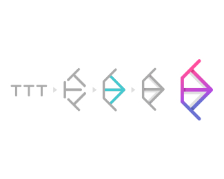
The only limitation around the creation was that the logo/isotype should show 3 t’s, coinciding with the beginning of all the words of the title of the workshop.
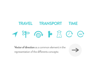
I also found it interesting to include in it, if possible, some visual concepts that would serve to express the different elements of the title (travel, transportation, time) and I concentrated on the possibility of finding an element that would be able to represent the 3 concepts at the same time.
After a study of the concepts, I came to the conclusion that all of them (travel, transportation, time) can be visually represented by a common element, an address vector. Therefore, the arrow emerged as the potential solution, since it is inherent in the nature of each concept.
As my intention was to simplify the visual load of the logo, my main objective was to try to merge the two elements as much as possible. In this way, and after numerous sketches, the solution was to position the 3 t’s in such a way that they formed an arrow; also, this positioning at the same time represents visually and schematically any kind of ways, roads, rails, paths, etc. that communicate with each other, so that a new level of significance is added to the logo in relation to the transportation and travels.
Finally, a shadow is added only to the shape of the arrow, with the aim of highlighting it, as well as a shading on top of the t’s, with the same purpose.
As seen on:
https://www.unpolo.com/ttt-case-study
Status:
Client work
Viewed:
891
Tags:
workshop
•
visual identity
•
vector
•
travel
Share:


Lets Discuss
Please login/signup to make a comment, registration is easy