Float
(Floaters:
2 )
Description:
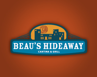
Logo Concept for Austin, TX restaurant
Status:
Nothing set
Viewed:
1826
Share:





Lets Discuss
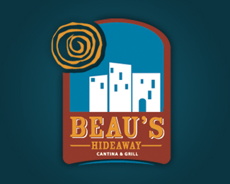
I like this concept much more than your vertical version. I think the space is used much better. %0D*%0D*I don't know what Beau's looks like, but the buildings in this version look more welcoming than in your other. These buildings have more distinct windows and doors, the other looks like an abandoned building (I don't mean to offend you:)
ReplyPlease login/signup to make a comment, registration is easy