Float
(Floaters:
4 )
Description:
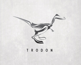
logo for the webcreators at trodon.
Status:
Nothing set
Viewed:
2368
Share:
Lets Discuss
interesting mark.... I'm trying to decipher the image, i see a dinosaur of some sort... looks a bit like a fossil tho because of the stylization. but its very unique. I'm wondering how the detail holds at smaller sizes, but i think you'd still see the silhouette of the creature so i don't think its a big problem. anywho, just some thoughts... well done
Replyinteresting thoughts tconrad. thank you for your reply!
ReplyIt appears that the nearer foot is a little too much more bigger and blacker than the rest of the illustration, but that could be my screen. It is a very good mark.
ReplyPlease login/signup to make a comment, registration is easy