Description:
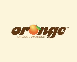
Designed for a local orange farm. They grow delicious organic oranges and other fruits as well. I love oranges, doesn't everybody? Come on, at least orange juice???
Status:
Nothing set
Viewed:
4312
Share:


Lets Discuss
Sorry but I read oronge, not orange. Try to solve it ando you'll have a good logo
ReplySorry but I read oronge, not orange. Try to solve it and you'll have a good logo
ReplyI think the fact that their is an orange in the middle of the type, should imply the word orange and not... 'oronge'. Works for me, :)
Replymake a 'o' as fruit and standar 'a'..it will solve both problems:)
ReplyI agree with liquor
ReplyI agree with Liquor, too. Great work!
ReplyI love the logo just the way it is. Anyone can clearly see it says Orange.*Sometimes we just try to find something to critique. I love your use of colors and overall retro look. I can see this logo clear as day on a retro tee. Could you tell me which font you used?*
ReplyMotterFemD up top... Weidermann Bold Italic down below. Thanks everyone for your comments. :)
ReplyTurning the O into an orange has already been done by a Terry's Chocolate Orange, I instantly thought of their logo when I saw this, it has a similar feel and perhaps the orange with chocolate text made me think of 'Chocolate Orange' who knows?! Or maybe I'm just hungry! It's different enough now but with the O as an orange may be a little too close, just my opinion: http://upload.wikimedia.org/wikipedia/commons/d/d6/Terry's_Chocolate_Orange.jpg*Jeez, I really fancy some chocolate now..... %3B)
ReplyI really like the feel of the logo as a whole. Earthy and fresh - perfect for organic produce.**Just a thought though, perhaps if you put more of a tilt on the orange so the leaf mimics the spine of an %22a%22 it might read less as %22oronge%22 (I couldn't help but see that too even though I knew what it should have been).
ReplyNice font choice I like the colors you chose for it too...Good Job!
ReplyPlease login/signup to make a comment, registration is easy