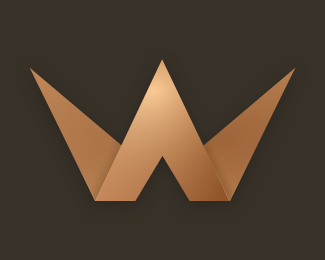
"W" Crown Concept
by thinkclay • Uploaded: Mar. 14 '18
Float
(Floaters:
1 )
Description:
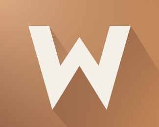
This logo brings uses a copper color instead of the typical gold. I've been a fan of origami logos and wanted to play with one myself. The shadows and gradients aren't awesome for a brand, but they do add a layer of depth and character to the design. I also like how this works as a "W" letterform.
Contact me: thinkclay@gmail.com if you're interested in purchasing this logo or hiring for logo/identity work.
Status:
Just for fun
Viewed:
2917
Tags:
•
works
•
w
•
royalty
Share:

Lets Discuss
Please login/signup to make a comment, registration is easy