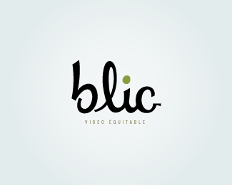
BLIC
by thesmallmonsters • Uploaded: Nov. 09 '10

Float
(Floaters:
4 )
Description:
Final logo for a small video production company. They wanted a logo that would be simple, unpretentious, and a bit retro.
I'm not satisfied with all of the letterforms, and I'm hoping to have time to make some adjustments to this one next year.
Status:
Client work
Viewed:
1665
Share:

Lets Discuss
'VIDEO EQUITABLE' is far, far....far too small in proportion to the larger, main type %5Bblic%5D. And, what does 'VIDEO EQUITABLE' mean anyhow? Please elaborate on that.
ReplyThanks for the comments. Alen, I know I need to work on the angles, it was a bit of a struggle for me.**JF, %22Equitable%22 is the equivalent of %22Fair Trade%22 in French. %22Video Equitable%22 doesn't have a fixed meaning, but the client uses it to express his company's values: working for ecologically minded companies for low prices or in exchange for services. It doesn't translate too well in English, but he's in Montr%E9al, where the term is very common.
ReplyAhh, I see! Thank you for the explanation. **So, I believe it is even more important now for you to make sure 'VIDEO EQUITABLE' is readable. Right now, it isn't readable at normal print sizes (logo on letterhead, envelopes, etc.)%3B it's barely legible at this larger size here on the site.
ReplyPlease login/signup to make a comment, registration is easy