by theWEBster • Uploaded: Sep. 28 '09
Add to Pad (In 2 Pad s )
Description: Logo for a contest Status: Nothing set Viewed: 1343 Share:
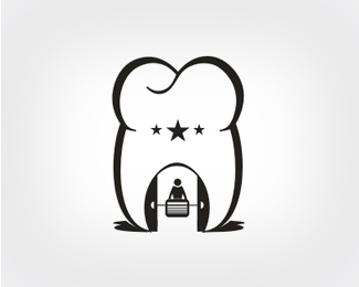
The symbol is quite big compared to the type but the concept is nice, quite a bit funny.
I'm liking the overall illustration style, however, the stars on the tooth remind me of cavities.
I like it, but i try to take out the dentist.*
thankx for the comments. maybe the type really is a little bit to big. but i wanted to make sure that all details could be seen.
Please login/signup to make a comment, registration is easy
Follow


Lets Discuss
The symbol is quite big compared to the type but the concept is nice, quite a bit funny.
ReplyI'm liking the overall illustration style, however, the stars on the tooth remind me of cavities.
ReplyI like it, but i try to take out the dentist.*
Replythankx for the comments. maybe the type really is a little bit to big. but i wanted to make sure that all details could be seen.
ReplyPlease login/signup to make a comment, registration is easy