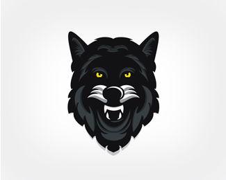
Float
(Floaters:
5 )
Description:
Logo for a german basketball-club. This is the mainpart of the logo.
Status:
Nothing set
Viewed:
1893
Share:



Lets Discuss
i think its good in general but maybe look at 3 things.**1. the detail on the top of the head is a lot finer than the detail around the sides and bottom**2. the tufts of hair just below the ears seems to be on the wrong angle or something. It kinda looks like the tufts are poking out of the ears. Maybe drop that tuft down a little.**3. the shape of the eyes seems a little too round and looks like he's been eating too many mushrooms.
ReplyHi cobaltcow,*thanks for your comment. I appreciate it. After that i changed some details and i darken the colors. Looks better for me :)
ReplyPlease login/signup to make a comment, registration is easy