SSG GRAPHICS
by tewodrosyifredew • Uploaded: Dec. 03 '12

Float
(Floaters:
0 )
Description:
I did this for a logo design contest. PLEASE CRITICIZE AS MUCH AS YOU CAN. I am a starting graphic designer, I need to know good design from bad design.
As seen on:
none for now
Status:
Student work
Viewed:
1210
Tags:
Design
•
Graphic Design
•
Logo Design
•
Logo
Share:
Lets Discuss
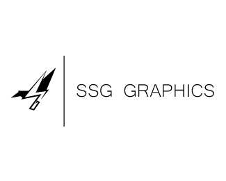
Note the two S in the middle and the G that make the leg of the bird.
ReplyThese are some questions I have:
ReplyWhat were the parameters of the logo contest?
What does SSG Graphics do?
Why did you choose a bird?
The element on the left doesn\'t resemble a bird closely enough. It is too abstract. It took me quite some time to actually figure out where each part of the bird was. On top of this, your letters aren\'t legible. I would have never known the leg of the bird was also a \"G\" without you telling me. Go back to the sketching phase.
Can\'t wait to see what you come back with.
What is the exact name you would like in your logo?
ReplySS Graphics
What is your industry?
Advertising and Marketing
What are the top 3 things you would like to communicate through your logo?
Corporate / Commercial - We target large corporate companies
Strength - Our company has been around for over 45 years
Quality, Ability, Capable - We have a top notch facility, equipment, and employees
What logo styles do you like (image text, image only, text only, etc.)
Text and Image but the option to use just the image. We also go by SSG for short.
Do you have any other info or links you want to share?
We specialize in large format printing for vehicle. We also do wall murals, vehicle wraps, signage, decals, etc. I have two other companies that work under this LLC that use the colors red and black. I also like using CMYK color scheme. I have attached our current logo for our vehicle wrap company. I do not want something this edgy for SS Graphics. SS Graphics should appeal more to corporations. I also need to be able to use the logo to just say SSG.
Well I went with a bird, made to origami vectors to suggest design, especially graphic design. They choose another logo. Yeah the TWO S\'s aren\'t exactly very legible. I have found that by suggesting different colors, mabe even shades and sharp edges that may connote a theme of design. I might try and save the design by making the s and g clearly visible. What do you suggest for the colors though?
ReplyNeither a bird or origami suggest \"graphic design\". Your client told you they like the CMYK color scheme, you could have chosen that. Like I said, go back to the sketching phase.
ReplyPlease login/signup to make a comment, registration is easy