minimal.lt
by teogreg • Uploaded: Apr. 23 '14 - Gallerized: Apr. '14

Float
(Floaters:
34 )
Description:
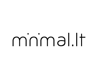
This logo is for minimal.lt, a website for a community that supports and organizes local ambient, minimal and experimental music events and projects in Lithuania.
The letters 'i' in the logo were removed and only their dots remained, to give the logo a more simplistic, basic feel.
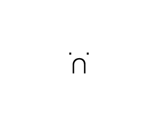
One variation of the logo is the full name of the website, while the other one I added is only the 'n' symbol and is clearly associated with the full name and would be used to gain further publicity due to its simple nature.
Status:
Unused proposal
Viewed:
32878
Tags:
white and black
•
simple
•
ambient
•
music
Share:

Lets Discuss
Awesome m'n'malism here!
ReplyHaha I see you made the phrase even more minimalistic than me
Replyperfect!
Reply@palattecorner
ReplyCheers mate, appreciate it :)
Made it to the gallery! This makes me very happy as this was my very first fully developed piece of work. Thanks guys for showing love and appreciation.
ReplyCheers!
I really like the idea, although the 'n' part seems like a sad face to me, which would not be the preferred association in branding. Other than that, good job
Reply@Gaffa cheers for the insight. The minimal crew do not really mind that association :)
Reply@ClimaxDesigns not at all. why?
clever, yet functional. I dig it.
ReplySmart, i like it
ReplyThis one is a winner.
ReplyAbout the fan, my guess would be - because of the awatar :D
awesome! but yeah, I see a sad face everytime I look :(
ReplyPlease login/signup to make a comment, registration is easy