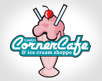
Float
(Floaters:
6 )
Description:
Logo for small town corner cafe, with authentic malts, and small town foods.
Status:
Client work
Viewed:
9778
Share:



Lets Discuss
looks very appropriate for an ice crem shop. I would go with a vanilla colored ice cream though...just to add some color contrast.
Replymuy bien!!!%0D*me gusta el aspecto retro%0D*%0D*me da la sensacion de que tienen buen servicio%0D*%0D*mi critica es que el nombre lindy%B4s esta muy chico hacerlo un poco mas grande y bajar un poco todas las lineas de texto para que a la linea negra de el contorno que rodea a todo el nombre hacerla igual de gruesa que el vaso.%0D*%0D*nota: cafe en espa%F1ol lleva acento en la letra %22E%22 caf%E9
ReplyI like it. I agree with kriecheque, it is very appropriate.
ReplyI am looking at it from the perspective of the employee who has to wear this smack in the middle of their chest on a t-shirt... the ice cream looks like the upper torso of a woman (cherry is the head) and she has really big boobs. If a woman has to wear this, she will get a lot of off-color remarks. (Been there.)
ReplyPlease login/signup to make a comment, registration is easy