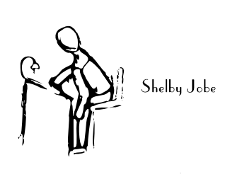
Shelby Jobe Marketing v2
by technowizard12 • Uploaded: Sep. 16 '10

Description:
My second concept for a marketing company.
Status:
Work in progress
Viewed:
745
Share:


Lets Discuss
What they think about this direction?
ReplyNot trying to offend, just giving some constructive criticism. I think your drawing is a little too rudimentary for people to take seriously. I know you were going for a hand drawn look but the overall illustration almost borders on child-like. And your type and illustration need to be more balanced with each other in terms of proportion. Good luck.
ReplyPlease login/signup to make a comment, registration is easy