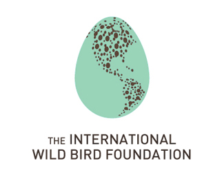
This is very clever and imo fantastic.. the bird looks a little generic though, but if you were to change anything on it i wouldnt recommend too much.%0D*%0D*Nice work tdf!
Thanks, all!*@nido - the bird is generic! I used a stock bird for the concept. I was going to redraw it if the concept was chosen...maybe I still will for myself....
Logo is the bomb! I would try to flip the bird the other way - like it goes away from the 'planet' or 'nest' and carries it within it's mouth! This way it looks like it's attacking it... But that's just me...


Lets Discuss
This is very clever and imo fantastic.. the bird looks a little generic though, but if you were to change anything on it i wouldnt recommend too much.%0D*%0D*Nice work tdf!
Replycool, great idea!
ReplyBrilliant idea. :-)
ReplyMarvellous!
ReplyGreat concept!
ReplyLove it - it's superior to the egg in my opinion.
Replywooooooooow! %0D*%0D*muy bien,
ReplyThanks, all!*@nido - the bird is generic! I used a stock bird for the concept. I was going to redraw it if the concept was chosen...maybe I still will for myself....
ReplyI agree with nido. Great logo.
ReplyAwesome concept!
ReplyTo bad they did not choose this. It is beautiful.
ReplyLogo is the bomb! I would try to flip the bird the other way - like it goes away from the 'planet' or 'nest' and carries it within it's mouth! This way it looks like it's attacking it... But that's just me...
ReplyAwesome!
ReplyWow - that's a beautiful logo.
ReplyThanks Rudy and cseven!
ReplyPlease login/signup to make a comment, registration is easy