Description:
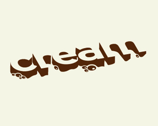
After approving the original logo (http://logopond.com/gallery/detail/18723), the client had a change of heart and asked for a more dimensional treatment. This is the result.
Status:
Client work
Viewed:
19229
Share:


Lets Discuss
That's great! I mean the original was, too ... but I think I like this one better. Good job, even if you were tired of the whole thing and not excited about revisiting it.
ReplyYea, I'm diggin this. I hope they paid you more. %3B-)
ReplyThanks, guys!*I wasn't excited about having to revise it at first, but I'm pleased with the way it turned out - The client is happy and I got paid more, so everybody wins! They were mainly concerned with the way it would animate on television....
ReplyThis is awesome TDF. Nice. I like it more than the other final. LOL. Good work.
ReplyAh, and you had great clients. Cheers to all!!
Replyi like this one... it's just creamy
ReplyI love it. Even better than the original. This turned out fantastic. Feels much more creamy.
Replygreat logo and excellent execution.
ReplyJust when I thought it could not get any better, you come up with this! Well done!
ReplyMan this Rocks!!
ReplyThis is much better than the 'other' final version - brilliant. Simple %26 effective.
ReplyAmazing! Will they have the animated logo on their website or just on screen
ReplyThanks everyone!*djuice: The animated logo will be on the site (www.creamproductions.ca) which we're in the process of re-designing. I'll post here when it's up!
Replyperfect
Replyi really like this..remindes me of fight club :)
Replythe best of your gallery! :D nice execution of the 3Dish look.
ReplyWow, I love this.....
ReplyAmazing!!! Great job
ReplyIt's great....
ReplyI like it, nice work...
ReplyI dig this one fo sho!!! It %22feels%22 right. Anyway great job!
ReplyAwesome work dude, i like it a lot, i love how it's only 1 color, but still very dinamic and dimensional, ftw
ReplyJust found out this logo has won an ADCC award!
ReplyCongratulation TDF! :)))
ReplyWell done!
ReplyI looked at this and just imagined it animating. Delicious.
Replyi wana eat it, or drink it... very nice and the animation it very nice too*
Replyi love this
ReplyThis is one of the lovely logos i've seen. Congrats!
ReplyCreamy layer ! :)
ReplyI saw your Cream Productions logo on TV last night. Woohoo!
ReplyThis is fabulous.
ReplyThat's awesome, Firebrand! They did a great job animating it.
ReplyGreat!!
ReplyThis is incredible.
ReplyCash Rules Everything Around Me? Great work!
ReplyPlease login/signup to make a comment, registration is easy