Description:
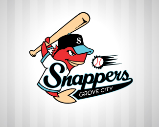
Logo for a fictional A-League baseball team. Oh, and a Mangrove is a type of snapper, so I decided the team would be from Grove City. (Mangrove sounded funny) Any and all feed back is more than welcome, as this project is still ongoing!
Status:
Nothing set
Viewed:
3239
Share:





Lets Discuss
Any feedback you all have is much appreciated. Thnx
Reply%22**: )**%22:http://www.youtube.com/watch?v%3D2hzxAWuW-8Y
Replyyesss my first response, thnx mang!
ReplyThis is much better than the %22s%22 type mark i saw previously. Nice illustration, but be careful with that %22s%22 on the cap in those specific colors, as it looks very close to an MLB team: seattle mariners. I like the colors, though.
ReplyI think the whole thing could be rotated counter-clockwise a couple more degrees. The %22grove city%22 type seems like an after thought...i would try out some different type faces...maybe customize it to fit nicely. Otherwise, I think this is really well done. *Not a fan of the colors.
ReplyPlease login/signup to make a comment, registration is easy