
Description:
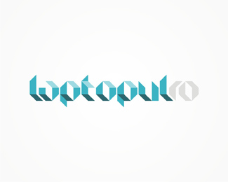
WIP. Re-branding proposal for romanian online and retail electronics distributor. Z was used as main element in their old logo. In here it's imagined as a keyboad key.
As seen on:
www.alextass.com
Status:
Nothing set
Viewed:
2322
Share:



Lets Discuss
I like the simplicity of it. The keyboard key doesn't pop out at me, but that doesn't seem to hurt the effectiveness of it. I like the font and think it goes well with retail electronics.**I wonder about the alignment of z-key. Maybe play around with aligning with the t.
ReplyPlease login/signup to make a comment, registration is easy