Description:
Logo redesign for Romanian advertising agency.
You can see a case study containing the old logo, concepts, stationery and the brand manual / logo guidelines on: http://www.designbynocturn.com/identity/cerebralart-rebranding.html and also on http://alextass.com/identity-design/branding-design
As seen on:
www.alextass.com
Status:
Client work
Viewed:
11752
Share:

Lets Discuss
wow! brilliant! am loving the type...one small tweak required with the top curve bit in the letter 'r' its seems a little off balance IMO
ReplyLove everything -- the 'point a to point b' work, the colors, the idea -- except the small, hard-to-read type at the bottom. It is a greytone, light weight, smooshed bunch of letters%3B if that sounds harsh, sorry for that. But, it's difficult to read.
ReplyThank you both for your comments and observations!
ReplyNice idea %26 colours as always! Agree with JohnM %26 JF about tweaks.
ReplyUPDATED. Almost everything about it. What do you think?
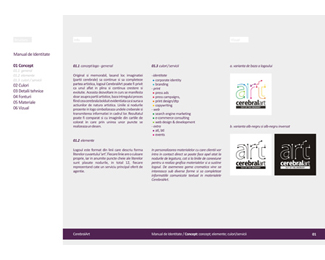
ReplyIf interested here is the %22brand manual / guidelines%22:http://www.behance.net/Gallery/CerebralArt-branding-manual/370368 for this project.
ReplyThanks for sharing, good job. I really like the connecting dots art part.
Replywell done tass :)
ReplyThank you!
Replynice!
ReplyThank you! :)
ReplyYou can see a case study containing the old logo, concepts, stationery and the brand manual / logo guidelines on: http://www.nocturn.ro/identity/cerebralart-rebranding.html
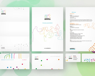
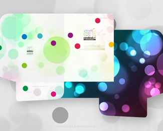
ReplyUPDATED: i have added images showing the stationery design and the folder design.
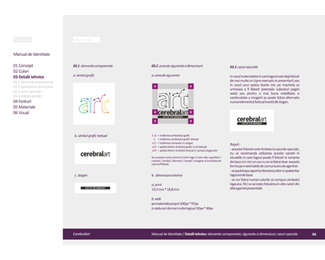
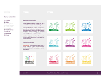
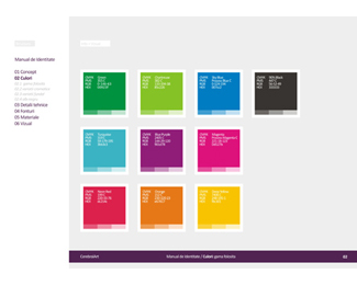
ReplyUPDATED with 4 pages from the brand manual.
Replyamazinnggg
ReplyPlease login/signup to make a comment, registration is easy