
Description:
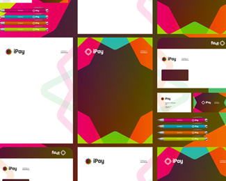
iPay identity design: logo design and stationery design (double sided business cards, double sided A4 letterhead, DL envelope, pens) created for a new online payments system.
As seen on:
http://alextass.com/
Status:
Client work
Viewed:
2774
Tags:
ipay
•
online payments systems
•
logo design
•
logo
Share:




Lets Discuss
I think it's too muddy in the middle? Anyway you could reverse it?
ReplyYou mean like having white in the middle @logomotive ?
ReplyDid you check the second image? I guess that's a viable variation of it (which does not include the muddy part).
I realize that is the correct color if you did a transparent overlay, but wonder if you could have a more inviting color combo?
ReplyPlease login/signup to make a comment, registration is easy