Friend Chain logo design
by tass • Uploaded: Jul. 12 '15

Float
(Floaters:
5 )
Description:
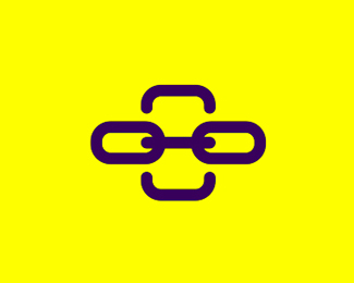
Logo design for Friend Chain, a visual related social app.
The symbol / icon shows:
- chain in the middle
- mobile phone shape in the negative space
- connections and interactions between chain links
- geeky character / assistant wearing glasses as a reference to visual content
As seen on:
http://alextass.com/
Status:
Unused proposal
Viewed:
3319
Tags:
mobile phone app
•
chain
•
friends
•
logo design
Share:


Lets Discuss
Cool mark, tass. I think you should think about a slightly different color scheme here. The yellow is so much lighter than the purple so it falls away when seen at a distance or at a glance. This is especially problematic within the mark, where you'd probably want people to see it (phone, chain, face) all at once. Plus, with the purple being a higher contrast against the white than the yellow is, it makes that part come forward in space. The yellow is a lower contrast so it falls back in space.
ReplyThanks for the input @samdemastrie I see your point. That was the reason for using a darker shade of yellow, not just a regular / bright one, but perhaps it was not enough. Thanks again for sharing your thoughts, appreciated.
ReplyPlease login/signup to make a comment, registration is easy