Description:
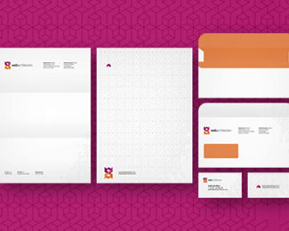
WebArchitecten is a web design studio based in Netherlands. Designed under and for WebArchitecten.
Larger stationery design at
http://alextass.com/identity-design/branding-design
As seen on:
www.alextass.com
Status:
Client work
Viewed:
16198
Tags:
advertising agency
•
web design agency
•
web design studio
•
logo
Share:




Lets Discuss
very nice shape Alex:)
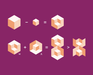
ReplyThank you! :) The symbol is based on a cube shape (their website will be designed in shape of a cube and they wanted this reflected in the logo) while having involved both initials (w and a).
Replysweet, tass. loven the colors on this one.
ReplyThanks a lot Mike!
ReplyThank you Ben!
ReplyThank you all for floats, really appreciate them!
ReplyUPDATED PROJECT.
Replyvery, very cool piece Alex !!
ReplySo cool, To me it Also says; The DNA of Web design.
ReplyTAS, you are always careful and kind, thank you.
ReplyThe DNA of web design? Never considered that, thank you Rudy.
Replyyes nice lovit
ReplyThank you CA!
ReplyUPDATED with the stationery design.
ReplyLarger size of the image in the description link.
looks great Alex !!
Replyawesome, nice use of the new feature aswell!
ReplyExcellent solution.
ReplyNice one!
ReplyVery clever identity concept, Alex! gj
ReplyWell done Alex.
ReplyPlease login/signup to make a comment, registration is easy