Description:
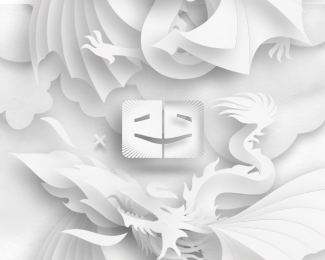
"Ego-AlterEgo is a visual exploration of good and evil in art", an art and design related blog. The logo shows 2 E letters, stylized to look like 2 heads face to face smiling to each other while in the same time forming together a larger smiling face (half lighten, half in shadow). You can visit the website to see it in action (both in header and footer). What do you think about it?
As seen on:
www.ego-alterego.com
Status:
Client work
Viewed:
5532
Share:

Lets Discuss
wow
Replyagree,looks realy amazing:)
ReplyThank you my friends!
ReplyThat's a great site you got going on there, man. Is it yours?
ReplyTerrebly cool!
Reply%5ETerribly :)
ReplyWow cool! I thought it was cut paper in the thumb.
ReplyReally like this Tass
ReplyThank you, thank you, thank you :) Well that was the intention to simulate a paper style model. It's a friend's project but i try to get involved and help with it too.
Replyas mentioned on dribbble, pretty cool!! :D
Replycrazy stuff, Alex!
Replyvery cool. love the paper model look here. time consuming, I'm sure but well worth it. nice indeed.
ReplyThanks a lot my friends!
Replyawsome one
Reply:) thanks!
ReplyThis is stunning. Love how it works on the webpage too
ReplyThanks Daniel! :)
Replythanks Charles!
ReplyPlease login/signup to make a comment, registration is easy