Description:
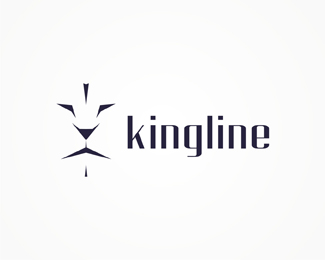
Experimental logo design work showing a lion and a customized type. Created for a company based in De Goorn, Netherlands.
As seen on:
www.alextass.com
Status:
Work in progress
Viewed:
14111
Share:

Lets Discuss
Mark of lion king is awesome, I would like to see better choice of font, maybe something simplier not so stylized.
Reply%5Eagreed, the lion does look awesome if a little overused these days
ReplyThank you both.**By a better choice of font what are you thinking about? A thinner one maybe? I've seen that the lion concept tends to be a bit overused lately, i am working on this for some time, i've just considered that now is a good time to place it online, gather some feedback, maybe improve it and finish it.**PS. can you see/imagine the doe and 2 birds in there? :)
ReplyI would not change on lions face anything, I really like it as it is. I would try typo with some common font like Helvetica ... maybe, thats a question ...
Replyvery nice mark, but i agree with others, about type :)
ReplyLion face is looking really great!
Replynice symbol great..
Replylove the mark alex
ReplyThank you all! :)*I have updated the type. what do you think about it now?
Replyit's great, man.
ReplyThank you! So, the new type works better with the symbol?
ReplyVery good man! beautyful!
ReplyWhat do you think about the new %5Bupdated%5D type/result? *
Replyperfection, wrap it up!
Reply%5Bupdated%5D
Replyi think it's a perfect match.
ReplyThank you mfrank!
ReplyThank you all for the floats!
ReplyThank you all again!
ReplyThose are strong lines, really nice !!
ReplyThank you!
ReplyReally great work, Alex! :)
ReplyThank you my friend!
ReplyVery precise looking' logo.
ReplyThank you Pierro!
ReplyGreat! Love the use of lines here.
ReplyThank you.
ReplyRoar!
Reply:)
ReplyHello,
ReplyPlease tell me the font name of this logo.
waiting for your reply.
Thank you in advance..
It's custom(ized) @amisoni08 :)
ReplyPlease login/signup to make a comment, registration is easy