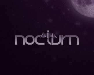
Description:
personal logo - final version. autumn 2009.
As seen on:
www.alextass.com
Status:
Client work
Viewed:
4238
Share:


Lets Discuss
I really don't know how did i forgot so many months to upload the final color version of my own logo... :))*Maybe because i am seeing it about daily?
Replyi love your website and colour scheme mate... not so sure on this font though. I think the bat looks more dynamic standing alone
ReplyHey, designabot, it seems that a lot of people liked more the stand alone bat rather than this version of it, but i wanted integrated in the name, and at the moment i didn't find any other better type solution than this one, which i felt it was expressing exactly the image i was looking for, something strong, straight, direct with a bit abstract/geometric feel. It's been a year and a half since i made it, so maybe one day i'll try some adjustments/updates on it. Thank you for the comment and compliment.
ReplyPlease login/signup to make a comment, registration is easy