by swapnet • Uploaded: Aug. 18 '09
Add to Pad (In 1 Pad )
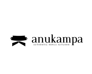
Description: Concept #1 Status: Unused proposal Viewed: 1703 Share:
I like the symbol on this one. How about centering the %22authentic...%22 with the large symbol and the restaurant name?
agree with tass ...I love the symbol as well.... I would in addition scale the logo down to an inch and see if the tagline is still readable. Always good to do with your logos.
Please login/signup to make a comment, registration is easy
Follow


Lets Discuss
I like the symbol on this one. How about centering the %22authentic...%22 with the large symbol and the restaurant name?
Replyagree with tass ...I love the symbol as well.... I would in addition scale the logo down to an inch and see if the tagline is still readable. Always good to do with your logos.
ReplyPlease login/signup to make a comment, registration is easy