Float
(Floaters:
0 )
Description:
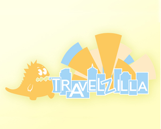
a recently completed design project to create identity for travel agents
Status:
Nothing set
Viewed:
992
Share:
Lets Discuss
i don't think you need the buildings or the light rays in your concept. with your godzilla mark and travelzilla name, people would get the idea. Your little godzilla is great (maybe he needs a snout), but i think your concept overall needs work.
Replyyeah, you're right. I ended up removing the light rays when I tried applying the logo to various products. It kept it a lot cleaner and more visible in smaller sizes. thanks for comment!
ReplyI'd choose darker colours to make bigger contrast between logo and background.
ReplyPlease login/signup to make a comment, registration is easy