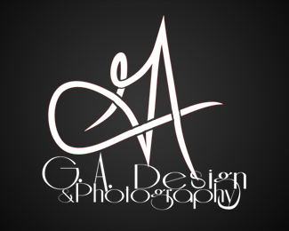
Description:
This is my first upload, so I'm wide open to suggestions.
Mark originally drawn for "G.A. Visuals", but the existing text was substituted.
I initially liked the chosen type, but I'm having second thoughts.
Status:
Just for fun
Viewed:
658
Share:
Lets Discuss
Ok, so I've clicked on this a few times and refrained from commenting. The old adage %22If you can't say something nice%22...but you ARE here for feedback. This is not good. Not good design. Terrible font choice and typography. Look at good logos on this site and learn from them. That's why it's an inspiration site. So I'm glad you put yourself out there for critique. But this follows no sound design principles. Have you taken design classes? I only ask, because if you are indeed serious about the design industry, you need to learn the basics from professionals.
ReplyLogoboom, I don't think that adage applies here, since I asked for suggestions, whether %22nice%22 or %22not, so I appreciate both the candor and sincerity of your comment.**To answer what may have been a rhetorical question, I haven't had design training and don't intend to have a career based in design (collective sigh of relief, everybody...). I have been a passive viewer of logopond for awhile now and decided to become a bit more active.**As for the logo itself, I certainly agree that the choice of font and subsequent customization did not work out as originally planned. If you don't mind humoring me, however, what do you think of the mark itself?
ReplyWell good...you are in the right place to observe works from very talented designers. As for the mark itself...it's not %22loose%22 enough in it's style to feel like a true free hand monogram. And it's not %22tight%22 enough to feel like a structured creation. It just falls in the middle. So i'd push it either one direction or the other. Thanks for taking my critique with a positive attitude.
ReplyHonestly, I kind of like the icon, and I respect your honesty too. There are a lot of things wrong with this logo, but being self taught myself and I can relate to beginner mistakes. First of all, just get rid of the type entirely- I think that's what really killing this. Right now its hard to look past it. I would also advise you to do what logoboom advised and really examine some of the better designers type treatments on this web site. To a beginner, its probably hard to understand how big of a difference it makes, but its massive. Good luck, and I hope this was a little insightful.
Replybleck...that was some terrible writing. I really need to start using the preview button.
Reply@ sullivanga - your mark is actually descent for a beginner, but as logoboom said, it still needs considerable work. As for the type, definitely scrap it. Part of being a good logo designer is knowing how to balance your mark with an appropriate type style. Your type choice is a crucial part of your design and can make or break a logo. Even the best designed mark will fall flat without the right type to compliment it.**You should probably choose a fairly simple font (possibly a sans-serif) so that it doesn't compete with your mark.
ReplyPlease login/signup to make a comment, registration is easy