kiwity
by subarroca • Uploaded: Aug. 26 '10

Float
(Floaters:
4 )
Description:
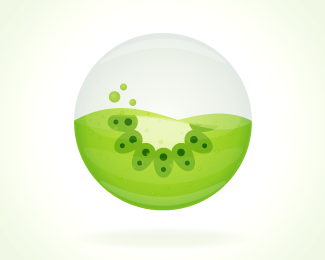
An orb containing the essence of kiwity properties, the kiwity. Waving because we are constantly moving and learning. 3 drops because of the 3 owners
Orb only
As seen on:
kiwity
Status:
Client work
Viewed:
8943
Share:

Lets Discuss
Cool icon and fresh coulour scheme. Nothing personal and sorry to say that but I do not like Diavlo...
Replywe chose diavlo because it's endings look a bit like leaves. Thanks though! :)
ReplyAgree with thomas, icons looks cool but I don't really like that font.
ReplyI understand what you say about the leaf feeling of Diavlo. Problem is it's overused and too much distinctive... Have you try to tweak it and appropriate it to make it yours? Some details are really awful to me (middle bar of the /w, bottom left part of /t and /y's leg). If you like fonts with this style, I hardly recommend you Omnes by Joshua Darden. It has this nice fresh and organic feeling. You may have look at some soft sans with curve to corner (http://www.fontshop.com/fontlist/genres/soft_sans_curve_to_corner/).*Also, don't know why you decided to bottom aligned icon and type... Keep on the good work!
ReplyThanks!*I've checked out Omnes but still lacks a bit of leafy look. But I do really like the link you shared, I'll check them out.*About the alignment, it's on the bottom because green liquid follows the same height as letters, do you think it would be better to center it? and what about the orb letter ratio?*Thanks for your comments!**
ReplyYou're right about Omnes but you could easily use it as base and tweak the way you like Diavlo. Another interesting font for this kind of job would be Yanone Kaffeesatz (http://www.dafont.com/yanone-kaffeesatz). I think it has also this positive and cool feeling and, very important too... it's free :)*I think there's also something off about the layout, something about proportions. First, logo is a way too big for this format (lack of breathing space). Second, centering orb is worth a shot (and what about adding a smooth shadow to make the orb floating?). Third, may be also adding some little space between orb and type.*Looking forward for updates!
Replyi really thank you all for your appreciations and I think it's really getting better with every step I make. I'll upload the new version today
Replynew version uploaded, brighter colors, more rounded ball, shadow added.*new font, ff cocon slightly thiner.*Gradient changed to make orb a little light emiting**Thanks to thomas and many others for their suggestions.
ReplyPlease login/signup to make a comment, registration is easy