Description:
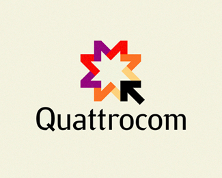
Logo for IT-company. A sign — the stylised letter "Q" in which the cursor reflects company activity.
Status:
Client work
Viewed:
9385
Share:

Lets Discuss
I really like this! Great graphic, but I do feel the type falls short of the rest of your design. I do think the graphic is beautifully strong though.
ReplyNice! And I have to disagree with gmax on the type choice - I think it's great. There's just enough going on with the font style to make it interesting and engaging without taking away from the mark, which is definitely the hero here.**Is the type custom, or is it a font family?
ReplyThanks. It is strongly modified font %22Yanus%22*http://paratype.com/pstore/default.asp?fcode%3DPT_YNS%26letter%3DY
Replysdijock - I see what you mean, but then maybe the type needs to be moved a little further away from the mark or made smaller - for me it takes a little something away, but overall it is a great logo, my comments are only because I actually really like it.
ReplyArt Machine has a similar logo in his showcase. Just so you are aware. %3B-)
ReplyGive the reference.
ReplyI have found. Amusing, but from a logo Art Machine letter Q would turn out better mine. It is simple coincidence
Reply:-)
ReplyI really like how you used the same 45 degree angle on the type cuts as well as the image. It reminds me of United Airlines branding system. They used something like a 70 degree angle on everything from logos to the angles of the coffee cups.
ReplyReally good %3D) Colorfull and well done. But i don%B4t like the type, agree with gmax about that.
ReplyPlease login/signup to make a comment, registration is easy