Float
(Floaters:
54 )
Description:
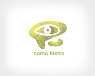
Theme Park Exhibit. Art director, designer, illustrator, James Strange.
Status:
Nothing set
Viewed:
6007
Share:


Lets Discuss
Wow, you keep rolling them out, don't you James. Nice!
ReplyOne thing keeps me away from the gun. Your age.
ReplyThanks, I think.
Replyjeeze...again..
Reply%5Eme to. I'd pay.
ReplyHaha, love the vintage faded curlicues and the scratch marks around the logo! Great!
Replynice work as always James, I am a huge fan.**Quick question, with all the love you get from the community on this site, do you give back?... by commenting on peoples work, offering advice, taking time to interpret comments, etc...**I can't recall you ever doing so on anything other than your own work - I could be wrong - which is why I ask.
Replybetter said, people would love to hear your insights on their work :)
ReplyDid you try having the nose come out of the circle?
ReplyWhat a beauty...
Replyjerron,**Yes. I thought it was out of balance. Besides I like the hidden peeking out feel it has.
ReplyNevertheless I love it.
ReplyFantastic attention to detail, great logo!
Replylove at first sight...
Replyyour style is always impressive.
ReplyOMG YOU ARE AMAZING**(now will you answer the question?)
ReplyWhat question raja?
ReplyPlease login/signup to make a comment, registration is easy